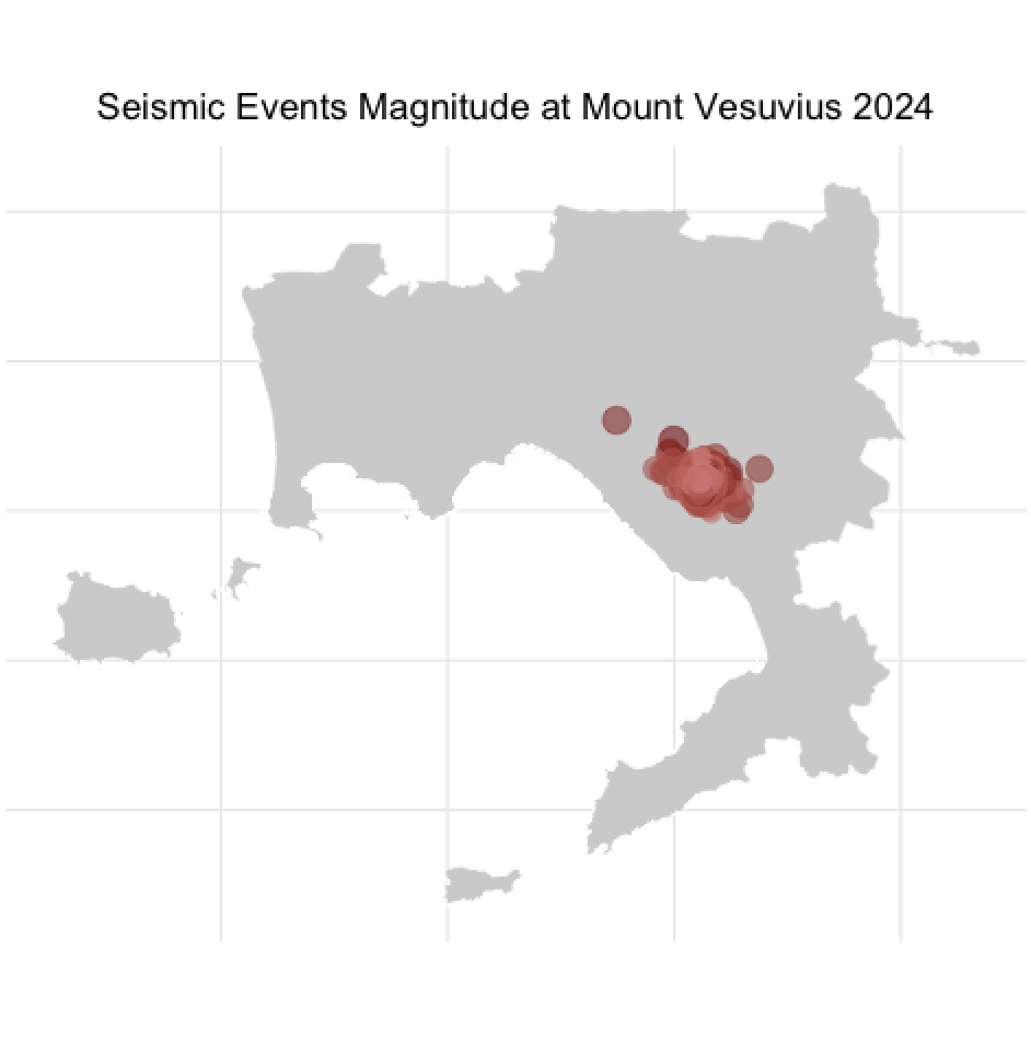
Blog

Machine Learning, Spatial Data Analysis, and so much more

Heatmap to Visualize Spatio-Temporal Data

This post shows how to create a heatmap with geom_tile() to visualize the spatio-temporal evolution of the vegetative period in the Chaudière-Appalaches region.

February 25, 2025

Using {pollen} and {vegperiod} to analyze temperature, GDD, and vegetation period

{pollen} and {vegperiod} are two R packages that can be used to analyze temperature, Growing Degree Days (GDD), and vegetation period. In this analysis, we explore historical temperature records, GDD trends, and vegetation period changes in Chaudières-Appalaches, Quebec, using these packages. By combining data visualization and exploratory data analysis (EDA) techniques, we uncover key patterns and anomalies that shed light on climate-driven changes in the region.

February 13, 2025

Aminated Visualisation for Centre-du-Québec’s Precipitation

Building upon previous analyses and predictive modeling, I details the process of creating this visualization, including data preparation, disaggregation to daily levels, and kriging for enhanced spatial resolution. The post culminates in an animated map that illustrates precipitation trends and anomalies over time, providing valuable insights for climate analysis, agriculture, and water resource management.