TyT2020W10 - 3D Aeras
By Johanie Fournier, agr. in rstats tidyverse tidytuesday
March 4, 2020
Get the data
game_goals <- readr::read_csv('https://raw.githubusercontent.com/rfordatascience/tidytuesday/master/data/2020/2020-03-03/game_goals.csv')
## Rows: 49384 Columns: 25
## ── Column specification ────────────────────────────────────────────────────────
## Delimiter: ","
## chr   (7): player, age, team, at, opp, location, outcome
## dbl  (17): season, rank, game_num, goals, assists, points, plus_minus, penal...
## date  (1): date
##
## ℹ Use `spec()` to retrieve the full column specification for this data.
## ℹ Specify the column types or set `show_col_types = FALSE` to quiet this message.
Explore the data
game<-game_goals %>%
  separate(age,into=c("annee", "jour"), "-") %>%
  mutate(annee=as.numeric(annee)) %>%
  select(season, annee, goals)

glimpse(game)
## Rows: 49,384
## Columns: 3
## $ season <dbl> 2006, 2006, 2006, 2006, 2006, 2006, 2006, 2006, 2006, 2006, 200…
## $ annee  <dbl> 20, 20, 20, 20, 20, 20, 20, 20, 20, 20, 20, 20, 20, 20, 20, 20,…
## $ goals  <dbl> 2, 0, 0, 1, 1, 0, 0, 2, 0, 0, 2, 0, 0, 2, 2, 1, 0, 1, 1, 0, 0, …
summary(game)
##      season         annee           goals
##  Min.   :1980   Min.   :18.00   Min.   :0.0000
##  1st Qu.:1997   1st Qu.:23.00   1st Qu.:0.0000
##  Median :2008   Median :27.00   Median :0.0000
##  Mean   :2005   Mean   :27.77   Mean   :0.4136
##  3rd Qu.:2014   3rd Qu.:32.00   3rd Qu.:1.0000
##  Max.   :2020   Max.   :45.00   Max.   :5.0000
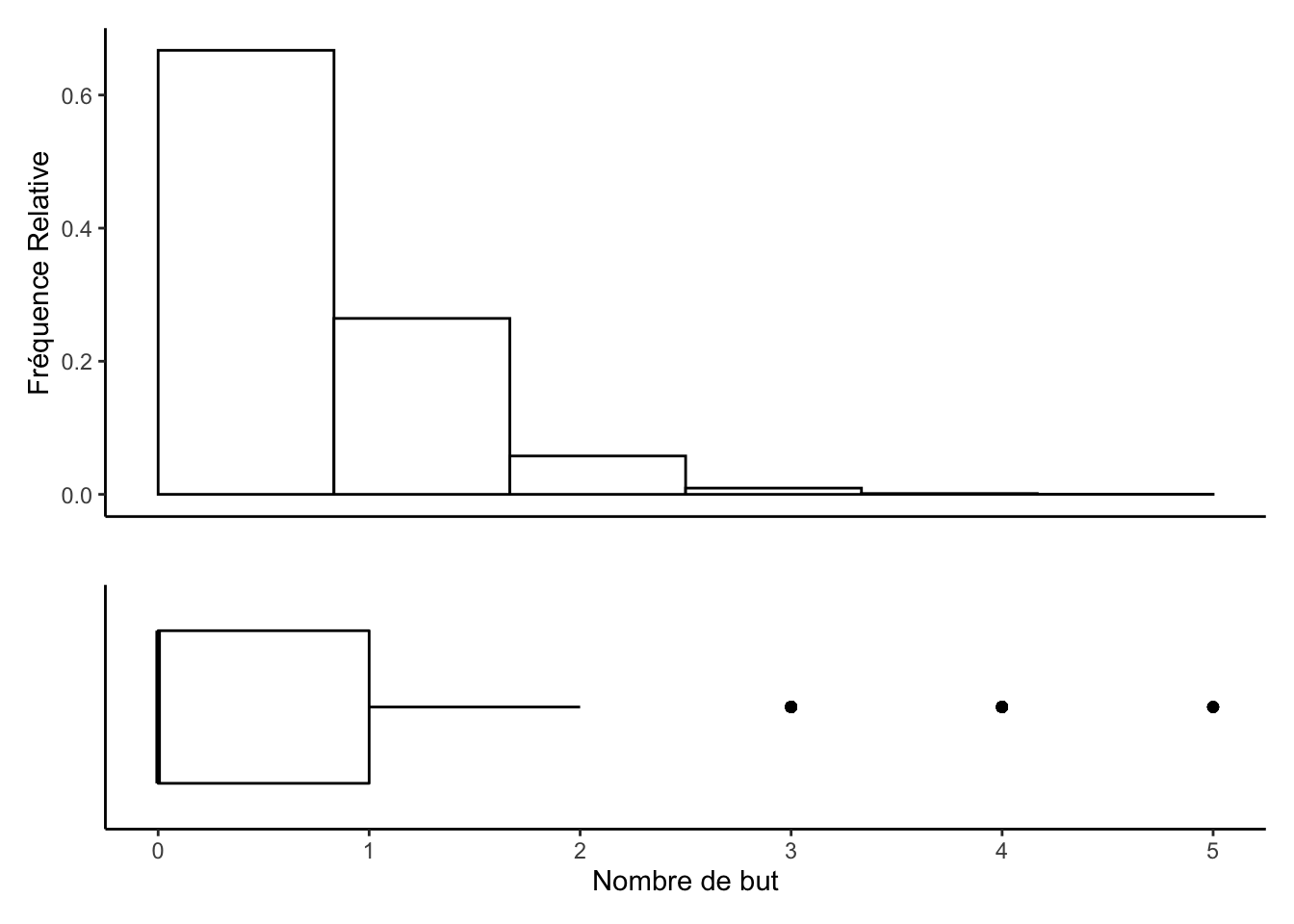
plt1 <-game %>%
  ggplot(aes(x=" ", y = goals)) +
  geom_boxplot(fill = "#FFFFFF", color = "black") +
  coord_flip() +
  theme_classic() +
  xlab("") +
  ylab("Nombre de but")+
  theme(axis.text.y=element_blank(),
        axis.ticks.y=element_blank())

plt2 <-game %>%
  ggplot() +
   geom_histogram(aes(x = goals, y = (..count..)/sum(..count..)),
                       position = "identity", binwidth = 1,
                       fill = "#FFFFFF", color = "black") +
   ylab("Fréquence Relative")+
   xlab("")+
  theme_classic()+
  theme(axis.text.x = element_blank())+
  theme(axis.ticks.x = element_blank())
plt2 + plt1 + plot_layout(nrow = 2, heights = c(2, 1))
## Warning: The dot-dot notation (`..count..`) was deprecated in ggplot2 3.4.0.
## ℹ Please use `after_stat(count)` instead.
## This warning is displayed once every 8 hours.
## Call `lifecycle::last_lifecycle_warnings()` to see where this warning was
## generated.
Prepare the data
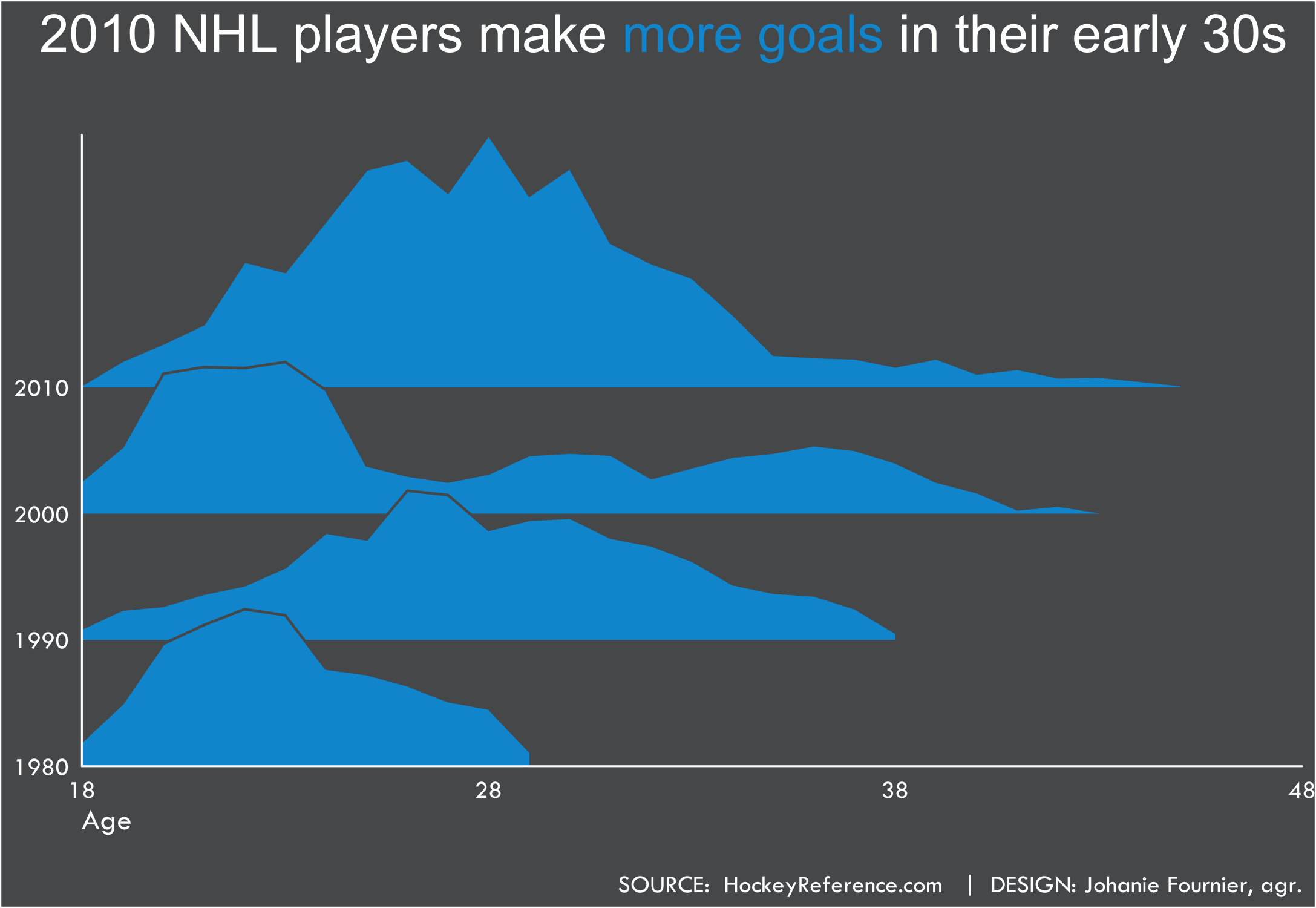
data<-game %>%
  mutate(decade = floor(season/10)*10) %>%
      group_by(decade, annee) %>%
      summarize_all(sum) %>%
      select(-season) %>%
      ungroup() %>%
  filter(!decade==2020)
Visualize the data
gg <- ggplot(data, aes(x=annee, y=decade, group=decade,height=goals))
gg <- gg + geom_density_ridges(stat="identity", scale = 2, fill="#0098D5", color="#58595B")
gg <- gg + theme(legend.position = 'none')
gg <- gg + scale_x_continuous(breaks = seq(18,48,10), limits=c(18, 48), expand=c(0, 0))
gg <- gg + scale_y_continuous(breaks = seq(1980,2010,10), limits=c(1980, 2030), expand=c(0, 0))

#modifier le thème
gg <- gg +  theme(plot.background = element_rect(fill = "#58595B"),
                  panel.background = element_rect(fill = "#58595B"),
                  panel.grid.major.y= element_blank(),
                  panel.grid.major.x= element_blank(),
                  panel.grid.minor = element_blank(),
                  axis.line.x = element_line(color="white"),
                  axis.line.y = element_line(color="white"),
                  axis.ticks.x = element_blank(),
                  axis.ticks.y = element_blank())
#ajouter les titres
gg<-gg + labs(title=
                "2010 NHL players make<span style='color:#0098D5'> more goals</span> in their early 30s   <br>",
              subtitle = " ",
              x="Age",
              y=" ",
              caption="\nSOURCE:  HockeyReference.com   |  DESIGN: Johanie Fournier, agr.")
gg<-gg + theme(  plot.title    = element_markdown(lineheight = 1.1,size=21, hjust=1,vjust=0.5, color="white"),
                 plot.subtitle = element_blank(),
                 plot.caption  = element_text(size=10, hjust=1,vjust=0.5, family="Tw Cen MT", color="white"),
                 axis.title.y  = element_blank(),
                 axis.title.x  = element_text(size=12, hjust=0,vjust=0.5, family="Tw Cen MT", color="white"),
                 axis.text.x   = element_text(size=10, hjust=0.5,vjust=0.5, family="Tw Cen MT", color="white"),
                 axis.text.y   = element_text(size=10, hjust=1,vjust=0.5, family="Tw Cen MT", color="white"))
- Posted on:
- March 4, 2020
- Length:
- 3 minute read, 494 words
- Categories:
- rstats tidyverse tidytuesday
- Tags:
- rstats tidyverse tidytuesday