TyT2020W08 - Comparison with Dumbells
By Johanie Fournier, agr. in rstats tidyverse tidytuesday
February 20, 2020
Get the data
food <- readr::read_csv("https://raw.githubusercontent.com/rfordatascience/tidytuesday/master/data/2020/2020-02-18/food_consumption.csv")
## Rows: 1430 Columns: 4
## ── Column specification ────────────────────────────────────────────────────────
## Delimiter: ","
## chr (2): country, food_category
## dbl (2): consumption, co2_emmission
##
## ℹ Use `spec()` to retrieve the full column specification for this data.
## ℹ Specify the column types or set `show_col_types = FALSE` to quiet this message.
Explore the data
glimpse(food)
## Rows: 1,430
## Columns: 4
## $ country       <chr> "Argentina", "Argentina", "Argentina", "Argentina", "Arg…
## $ food_category <chr> "Pork", "Poultry", "Beef", "Lamb & Goat", "Fish", "Eggs"…
## $ consumption   <dbl> 10.51, 38.66, 55.48, 1.56, 4.36, 11.39, 195.08, 103.11, …
## $ co2_emmission <dbl> 37.20, 41.53, 1712.00, 54.63, 6.96, 10.46, 277.87, 19.66…
food %>%
  count(food_category) %>%
  knitr::kable()
| food_category | n |
|---|---|
| Beef | 130 |
| Eggs | 130 |
| Fish | 130 |
| Lamb & Goat | 130 |
| Milk - inc. cheese | 130 |
| Nuts inc. Peanut Butter | 130 |
| Pork | 130 |
| Poultry | 130 |
| Rice | 130 |
| Soybeans | 130 |
| Wheat and Wheat Products | 130 |
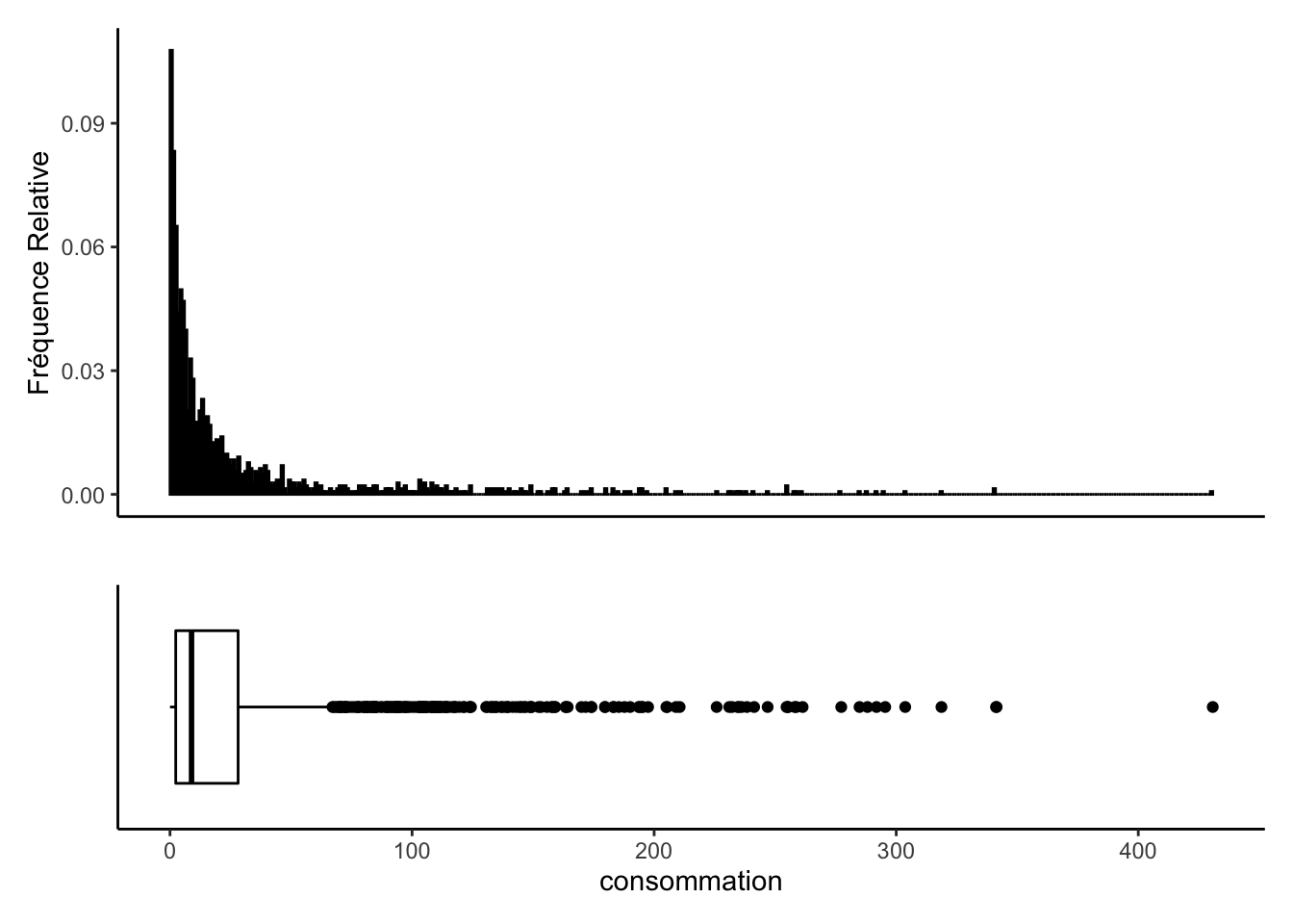
plt1 <-food %>%
  #filter(adr<=225, adr>0) %>%
  ggplot(aes(x=" ", y = consumption)) +
  geom_boxplot(fill = "#FFFFFF", color = "black") +
  coord_flip() +
  theme_classic() +
  xlab("") +
  ylab("consommation")+
  theme(axis.text.y=element_blank(),
        axis.ticks.y=element_blank())

plt2 <-food %>%
  #filter(adr<=225, adr>0) %>%
  ggplot() +
   geom_histogram(aes(x = consumption, y = (..count..)/sum(..count..)),
                       position = "identity", binwidth = 1,
                       fill = "#FFFFFF", color = "black") +
   ylab("Fréquence Relative")+
   xlab("")+
  theme_classic()+
  theme(axis.text.x = element_blank())+
  theme(axis.ticks.x = element_blank())
plt2 + plt1 + plot_layout(nrow = 2, heights = c(2, 1))
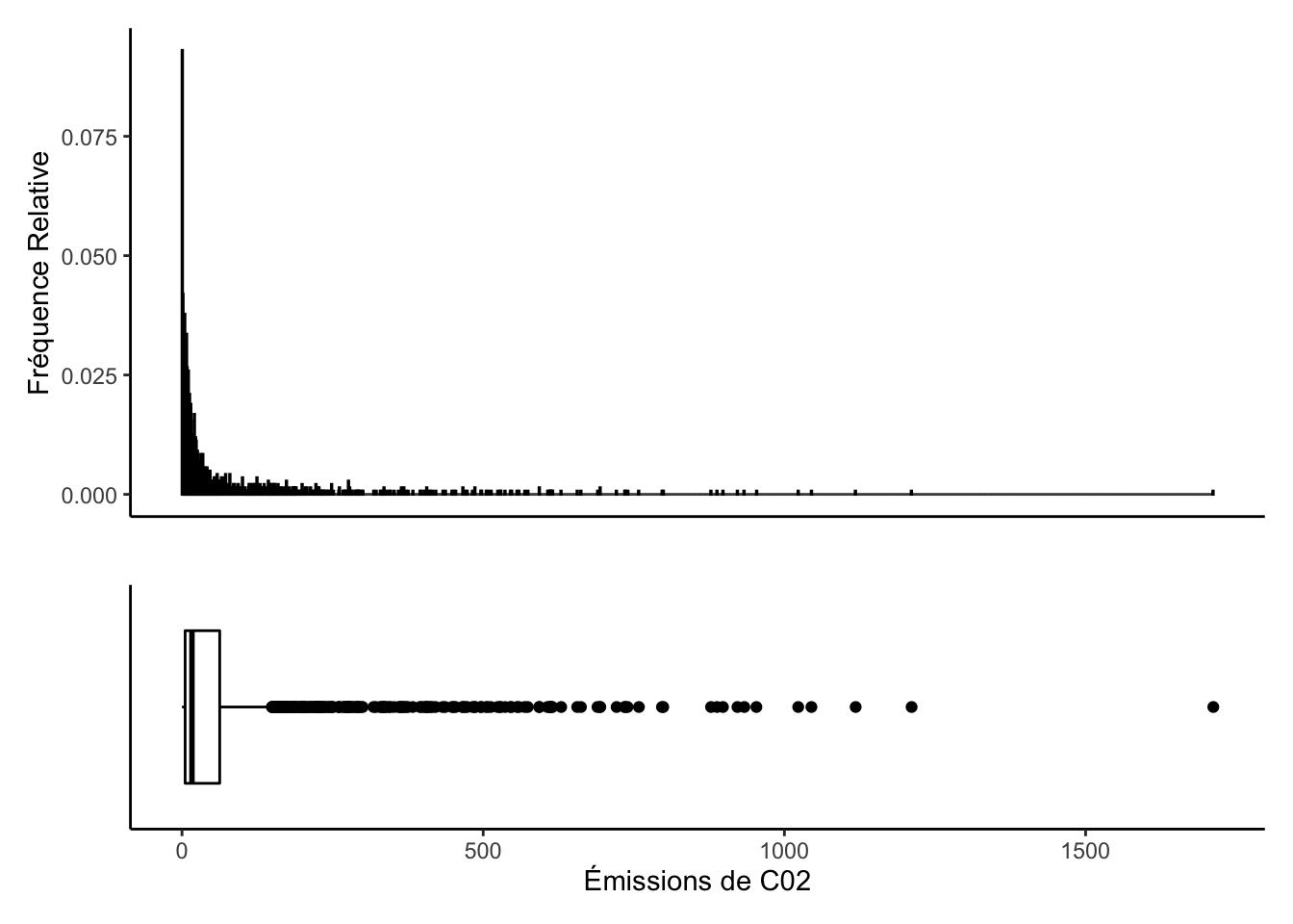
plt1 <-food %>%
  #filter(adr<=225, adr>0) %>%
  ggplot(aes(x=" ", y = co2_emmission)) +
  geom_boxplot(fill = "#FFFFFF", color = "black") +
  coord_flip() +
  theme_classic() +
  xlab("") +
  ylab("Émissions de C02")+
  theme(axis.text.y=element_blank(),
        axis.ticks.y=element_blank())

plt2 <-food %>%
  #filter(adr<=225, adr>0) %>%
  ggplot() +
   geom_histogram(aes(x = co2_emmission, y = (..count..)/sum(..count..)),
                       position = "identity", binwidth = 1,
                       fill = "#FFFFFF", color = "black") +
   ylab("Fréquence Relative")+
   xlab("")+
  theme_classic()+
  theme(axis.text.x = element_blank())+
  theme(axis.ticks.x = element_blank())
plt2 + plt1 + plot_layout(nrow = 2, heights = c(2, 1))
Prepare the data
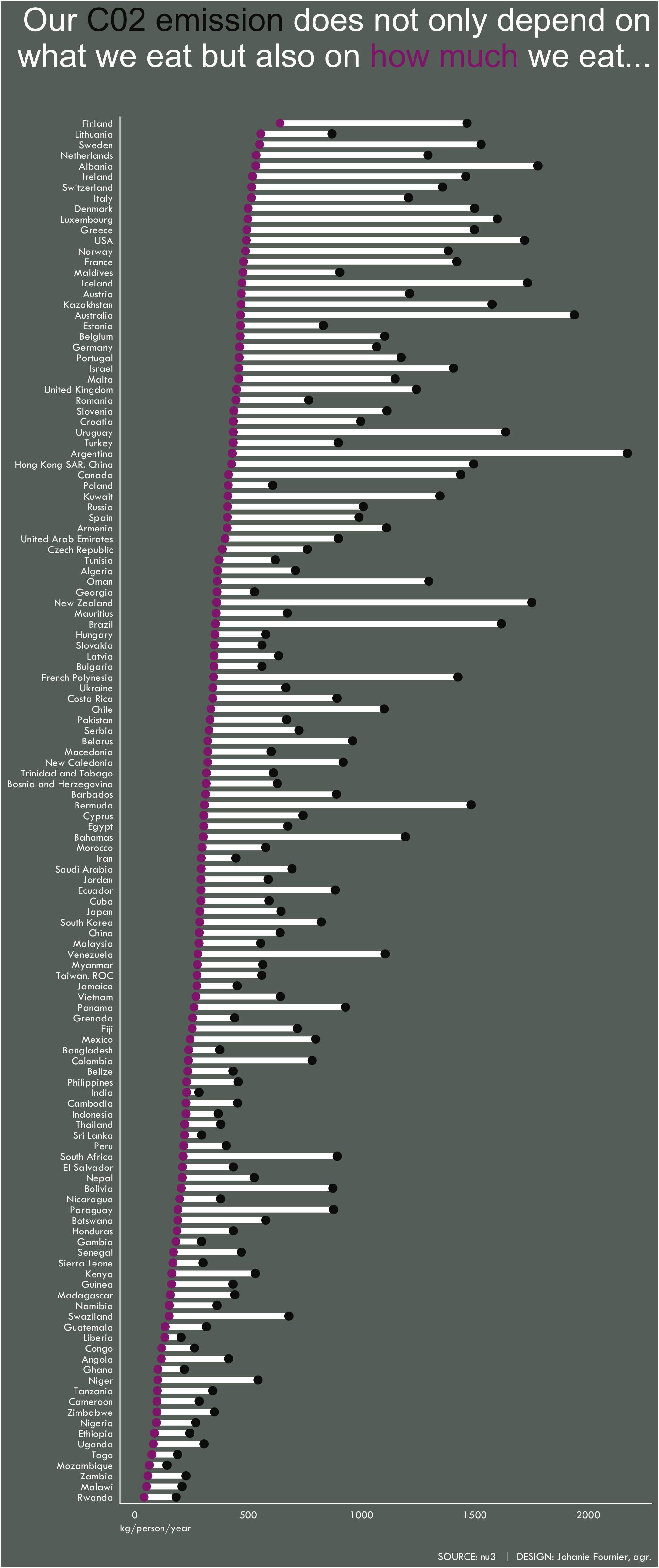
data_tot<-food %>%
  group_by(country) %>%
  summarise_if(is.numeric, sum, na.rm=TRUE) %>%
  ungroup()
Visualize the data
#Graphique
gg<-ggplot()
#Dumbell
gg<-gg + ggalt::geom_dumbbell(data=data_tot,
                     aes(x = consumption, xend = co2_emmission, y = reorder(country,consumption),group = country),
                     colour = "white",
                     size = 2,
                     colour_x = "#922A7D",
                     colour_xend = "#0F0E0E",
                     dot_guide_size=0)
#modifier le thème
gg <- gg +  theme(plot.background = element_rect(fill = "#687169"),
                  panel.background = element_rect(fill = "#687169"),
                  panel.grid.major.y= element_blank(),
                  panel.grid.major.x= element_blank(),
                  panel.grid.minor = element_blank(),
                  axis.line.x = element_line(color="white"),
                  axis.line.y = element_line(color="white"),
                  axis.ticks.x = element_blank(),
                  axis.ticks.y = element_blank())
#ajouter les titres
gg<-gg + labs(title=
                "Our <span style='color:#0F0E0E'>C02 emission</span> does not only depend on<br>what we eat but also on <span style='color:#922A7D'>how much</span> we eat...<br>",
              subtitle = " ",
              x="kg/person/year",
              y=" ",
              caption="\nSOURCE: nu3   |  DESIGN: Johanie Fournier, agr.")
gg<-gg + theme(  plot.title    = element_markdown(lineheight = 1.1,size=24, hjust=1,vjust=0.5, color="white"),
                 plot.subtitle = element_blank(),
                 plot.caption  = element_text(size=8, hjust=1,vjust=0.5, family="Tw Cen MT", color="white"),
                 axis.title.y  = element_blank(),
                 axis.title.x  = element_text(size=8, hjust=0,vjust=0.5, family="Tw Cen MT", color="white"),
                 axis.text.x   = element_text(size=8, hjust=0.5,vjust=0.5, family="Tw Cen MT", color="white"),
                 axis.text.y   = element_text(size=8, hjust=1,vjust=0.5, family="Tw Cen MT", color="white"))
- Posted on:
- February 20, 2020
- Length:
- 3 minute read, 476 words
- Categories:
- rstats tidyverse tidytuesday
- Tags:
- rstats tidyverse tidytuesday